too cool for school ↗
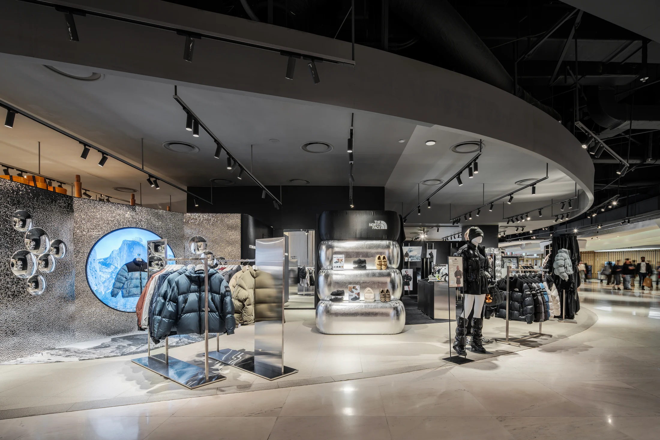

LOTTE WORLD MALL / SEOUL
Overview
눕시 패딩의 물성을 공간의 언어로 확장하다.
THE NORTH FACE WHITE LABEL의 신제품 눕시 컬렉션을 소개하는 팝업 스토어입니다. 개방된 롯데월드몰의 환경 안에서 컬렉션의 존재감과 화이트라벨 특유의 정제된 이미지를 함께 전달해야 했습니다.
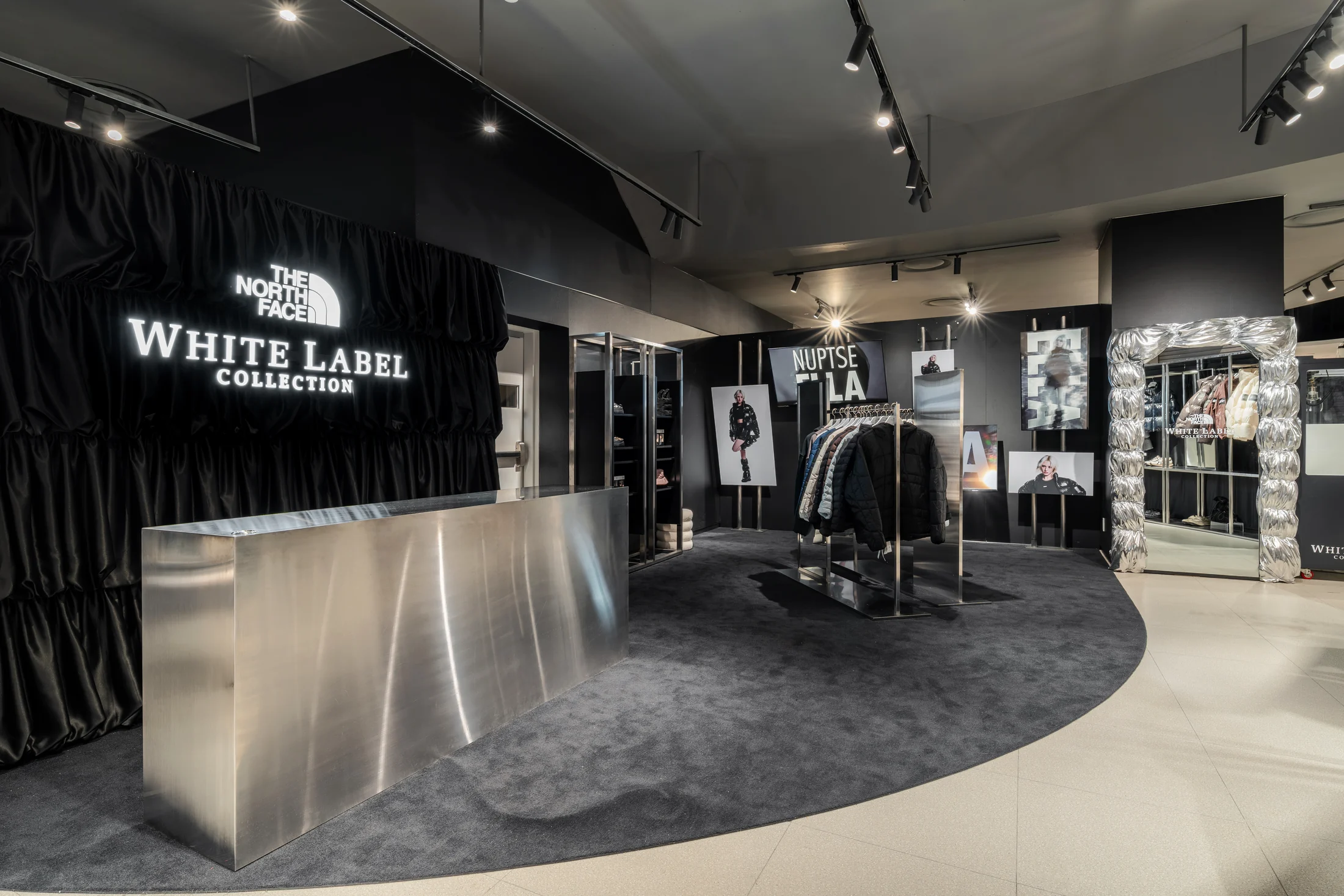
MAREVE는 많은 제품과 캠페인 비주얼을 단순히 배치하는 대신, 눕시 패딩에서 발견한 볼륨과 주름, 빛을 반사하는 표면을 하나의 공간 언어로 연결했습니다. 제품의 물성이 벽과 가구, 디스플레이로 확장되며 컬렉션 전체가 하나의 장면으로 읽히도록 구성했습니다.
Extending the material character of the Nuptse puffer into a spatial language.
This pop-up store introduced THE NORTH FACE WHITE LABEL's new Nuptse collection. Within the open setting of Lotte World Mall, the space needed to convey both the presence of the collection and White Label's refined identity.
Rather than simply arranging products and campaign visuals, MAREVE connected the volume, folds, and reflective surfaces found in the Nuptse puffer as one spatial language. The material qualities of the product extend into walls, furniture, and displays, allowing the entire collection to read as a single scene.
Spatial Strategy
패딩의 형태가 아닌, 형태를 만드는 원리를 공간의 스케일로 옮기다.
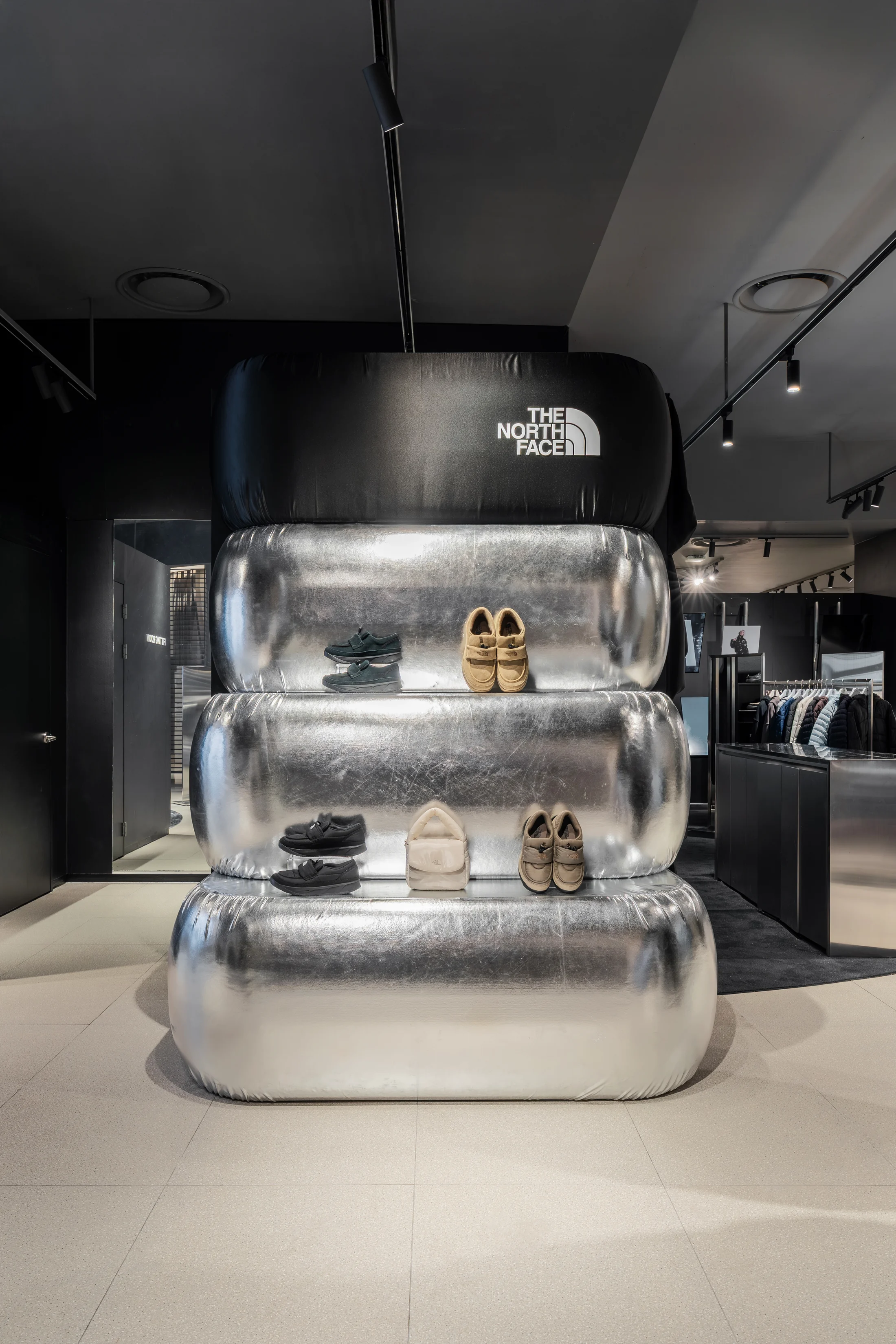
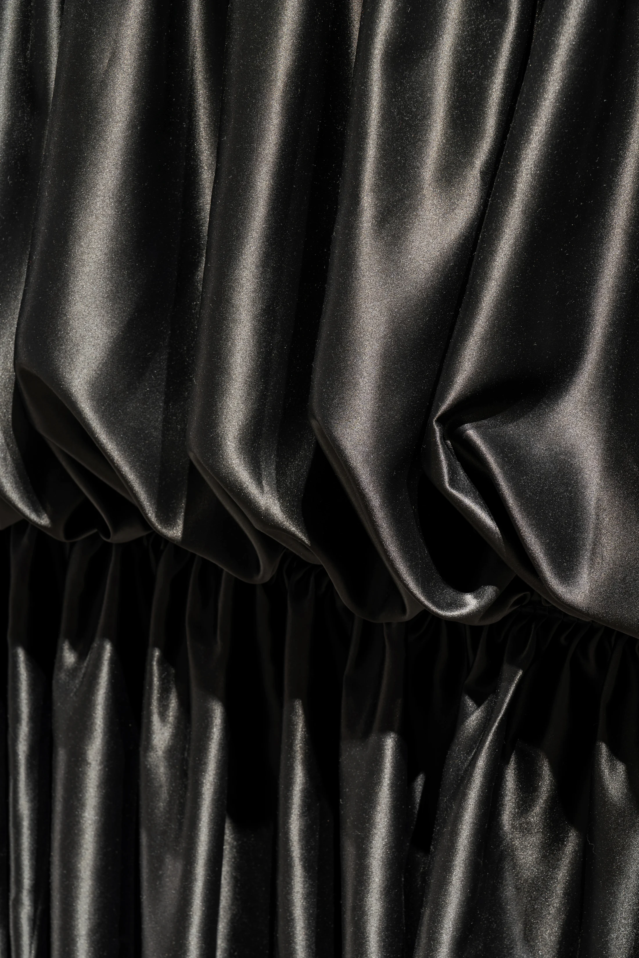
눕시 패딩에서 읽은 핵심은 공기를 머금은 듯한 부피, 충전재와 봉제선이 만드는 주름, 그리고 빛에 따라 달라지는 광택이었습니다. 이 세 가지 성질을 VOLUME, FOLD, REFLECTION이라는 공간의 문법으로 전환했습니다.
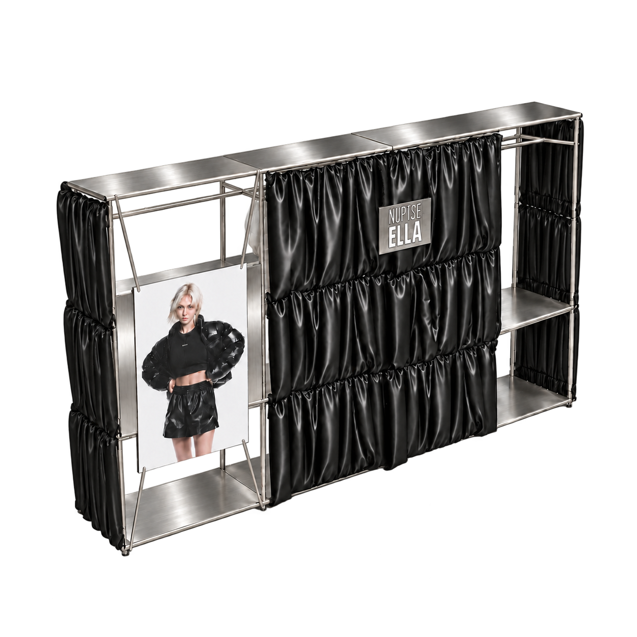
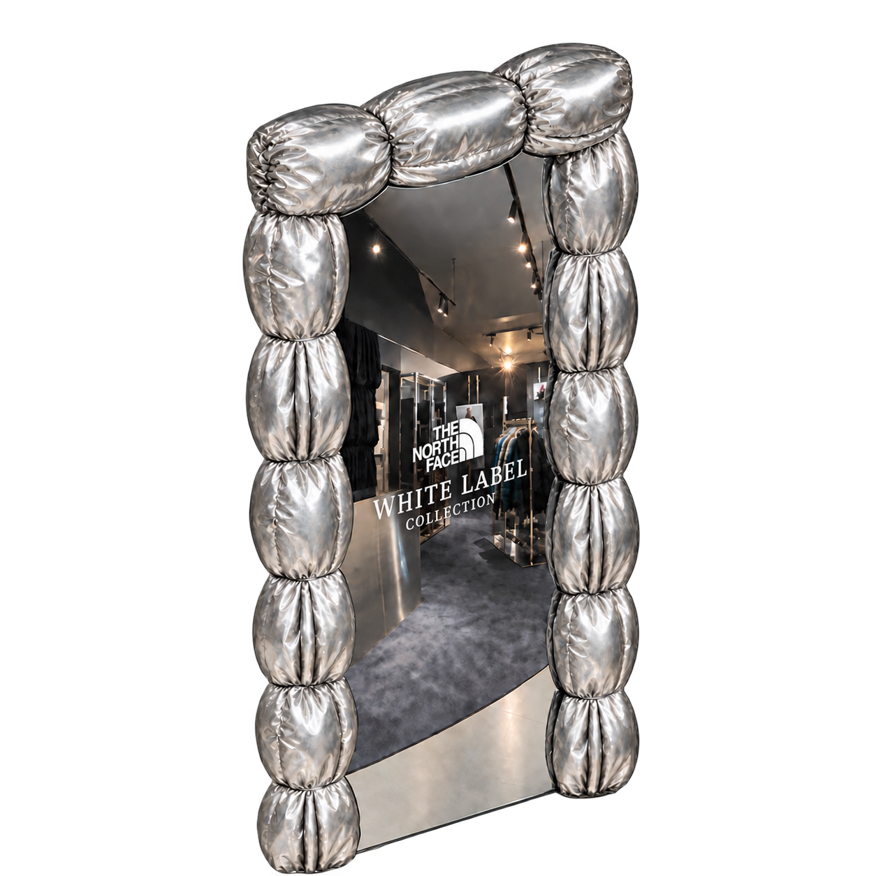
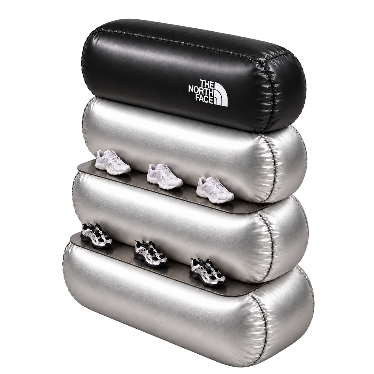
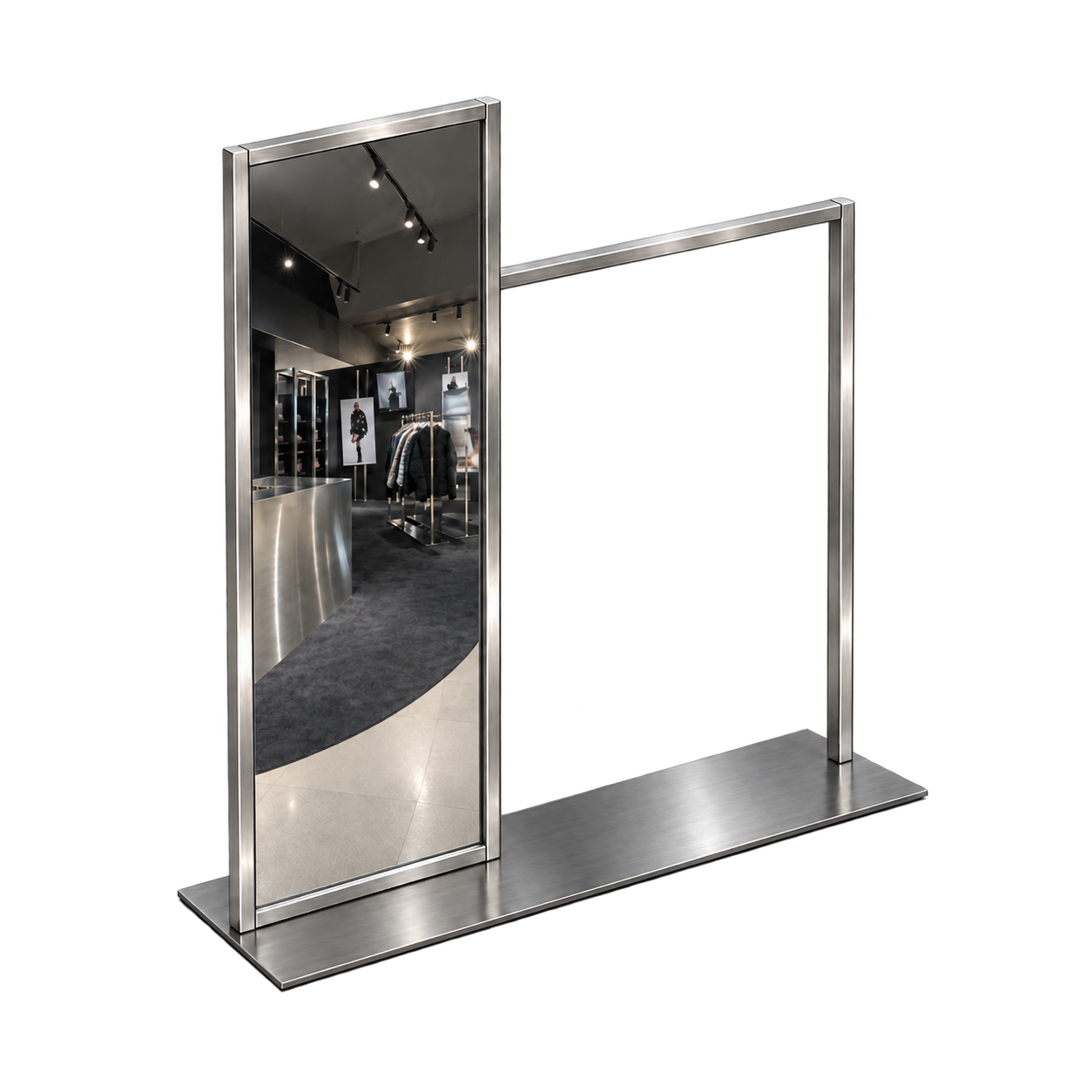
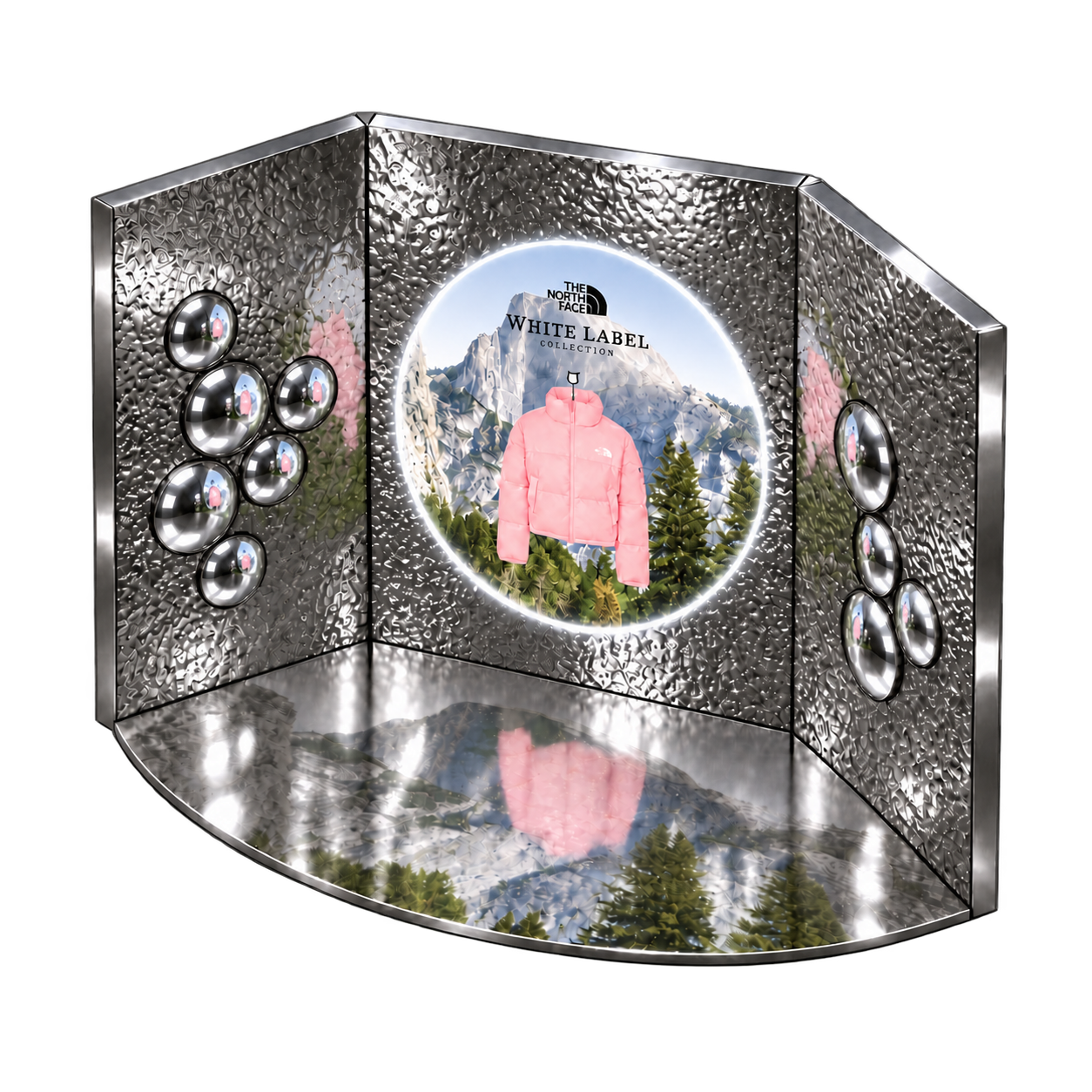
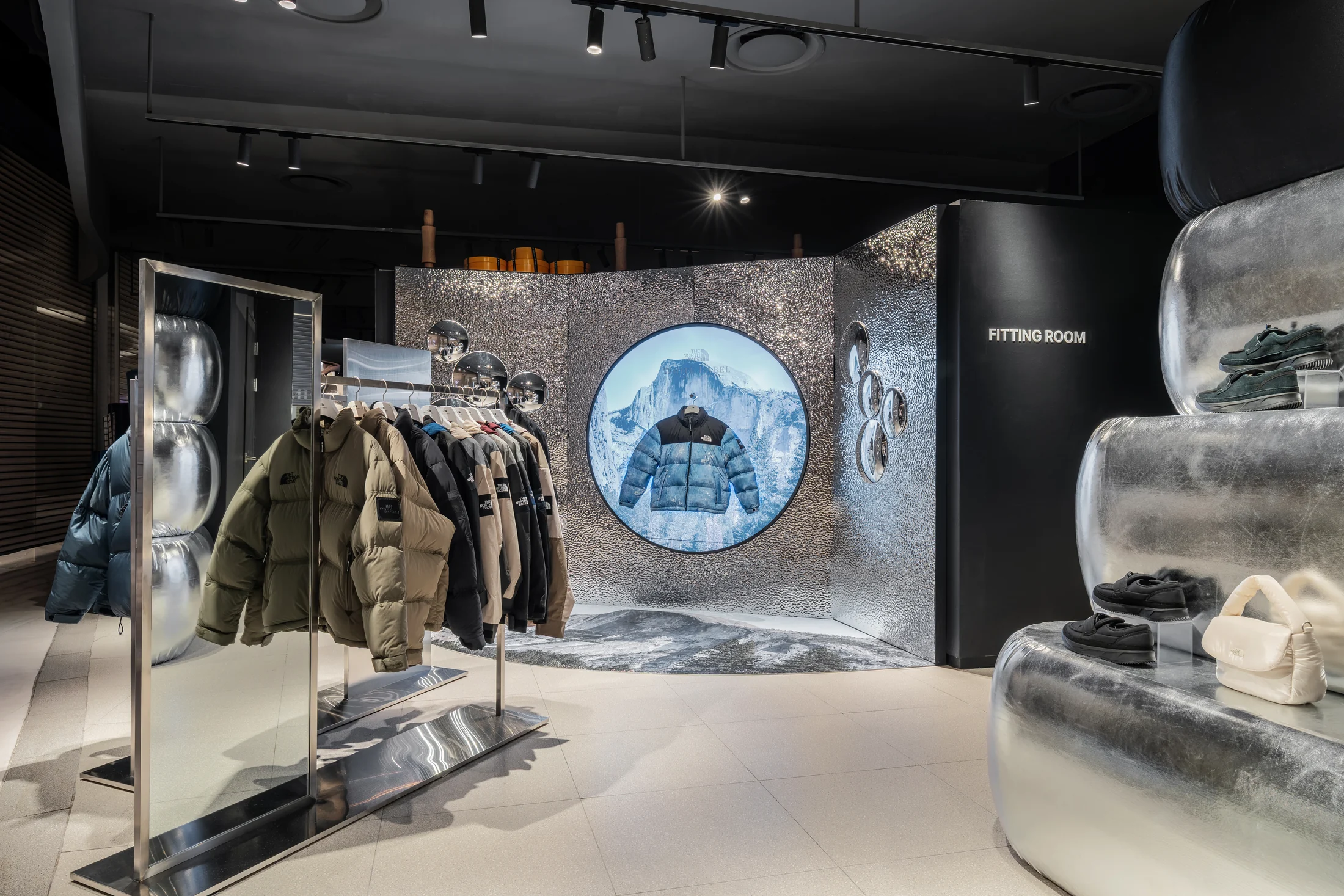
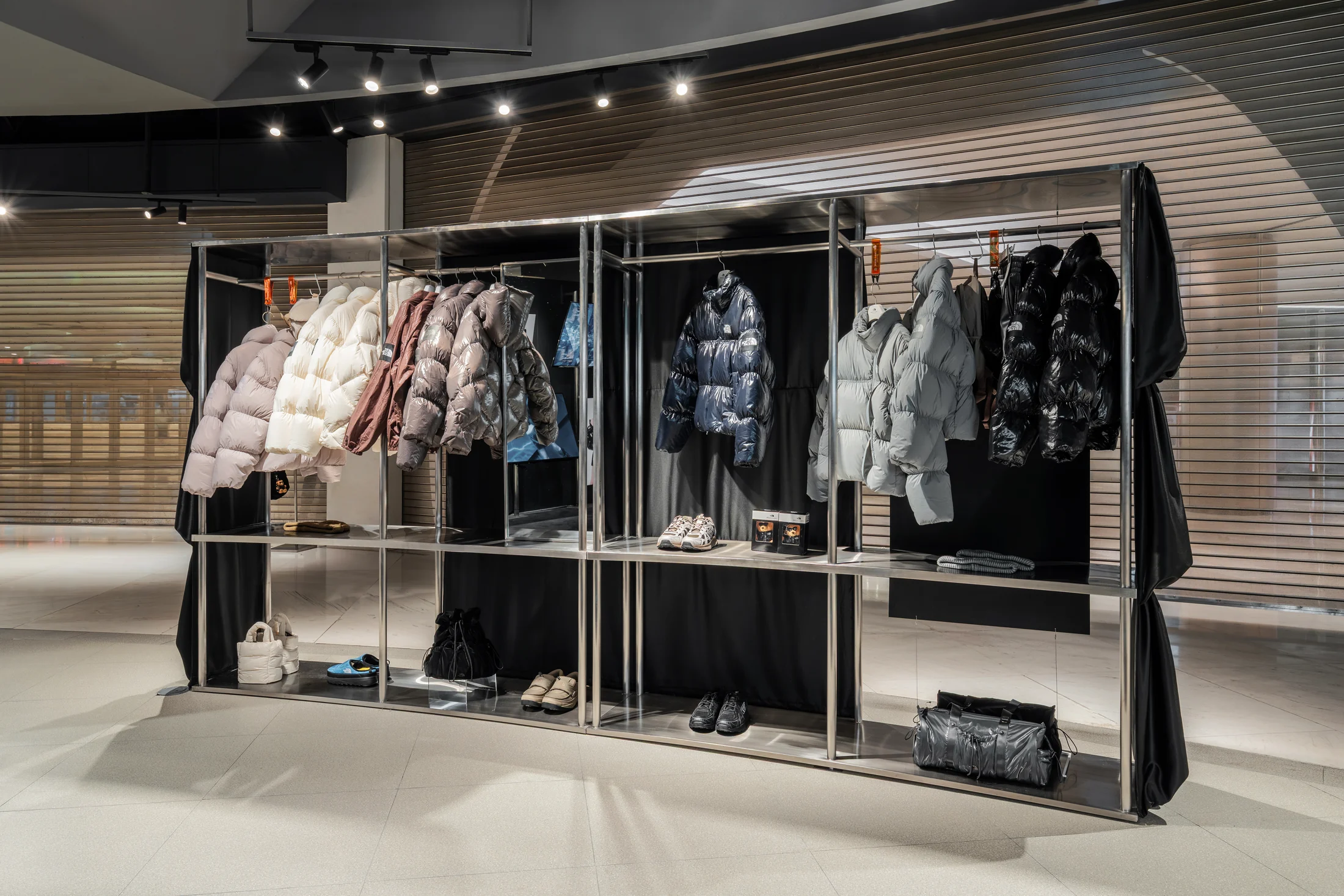
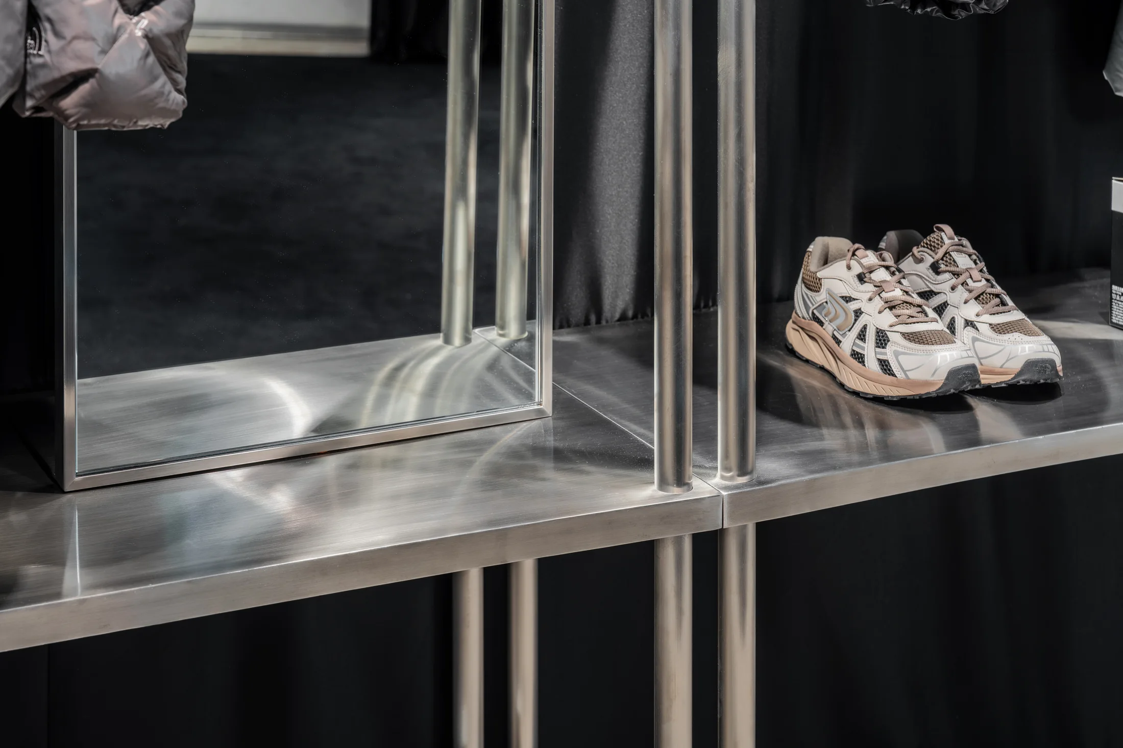
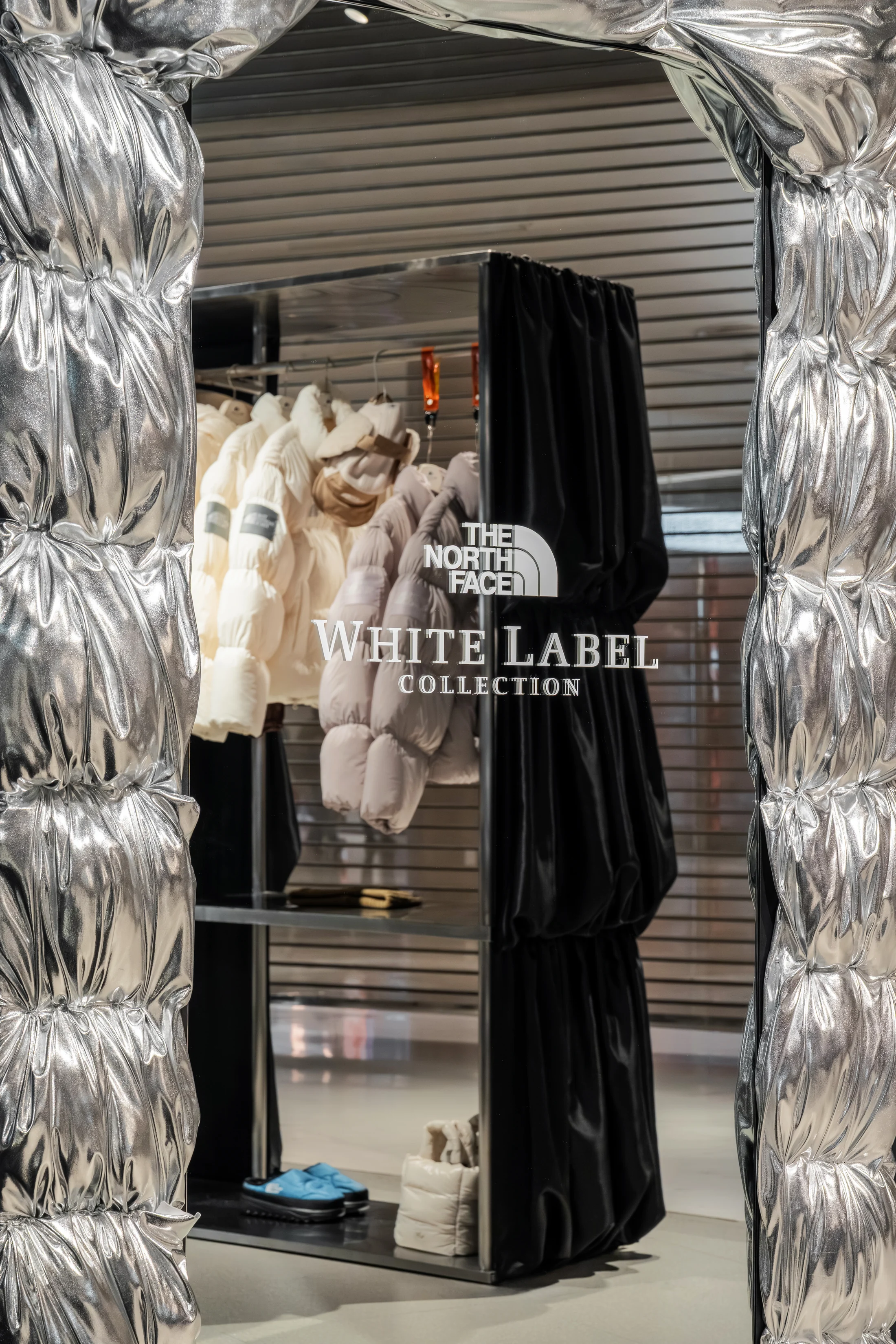
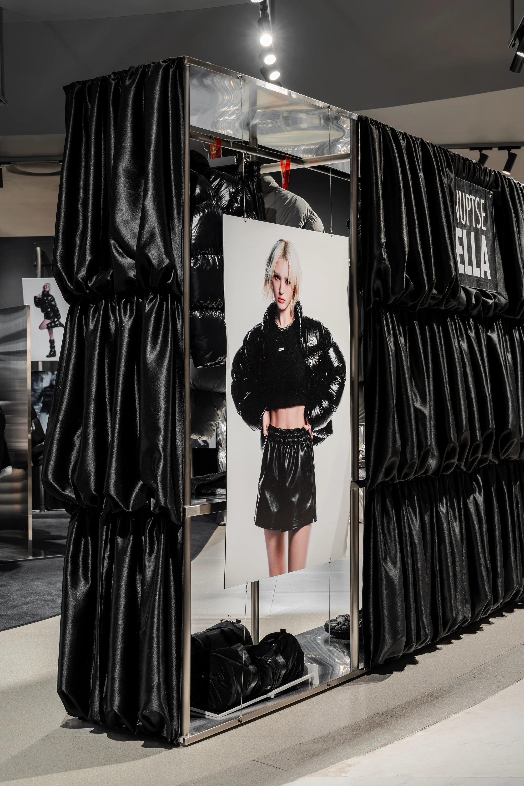
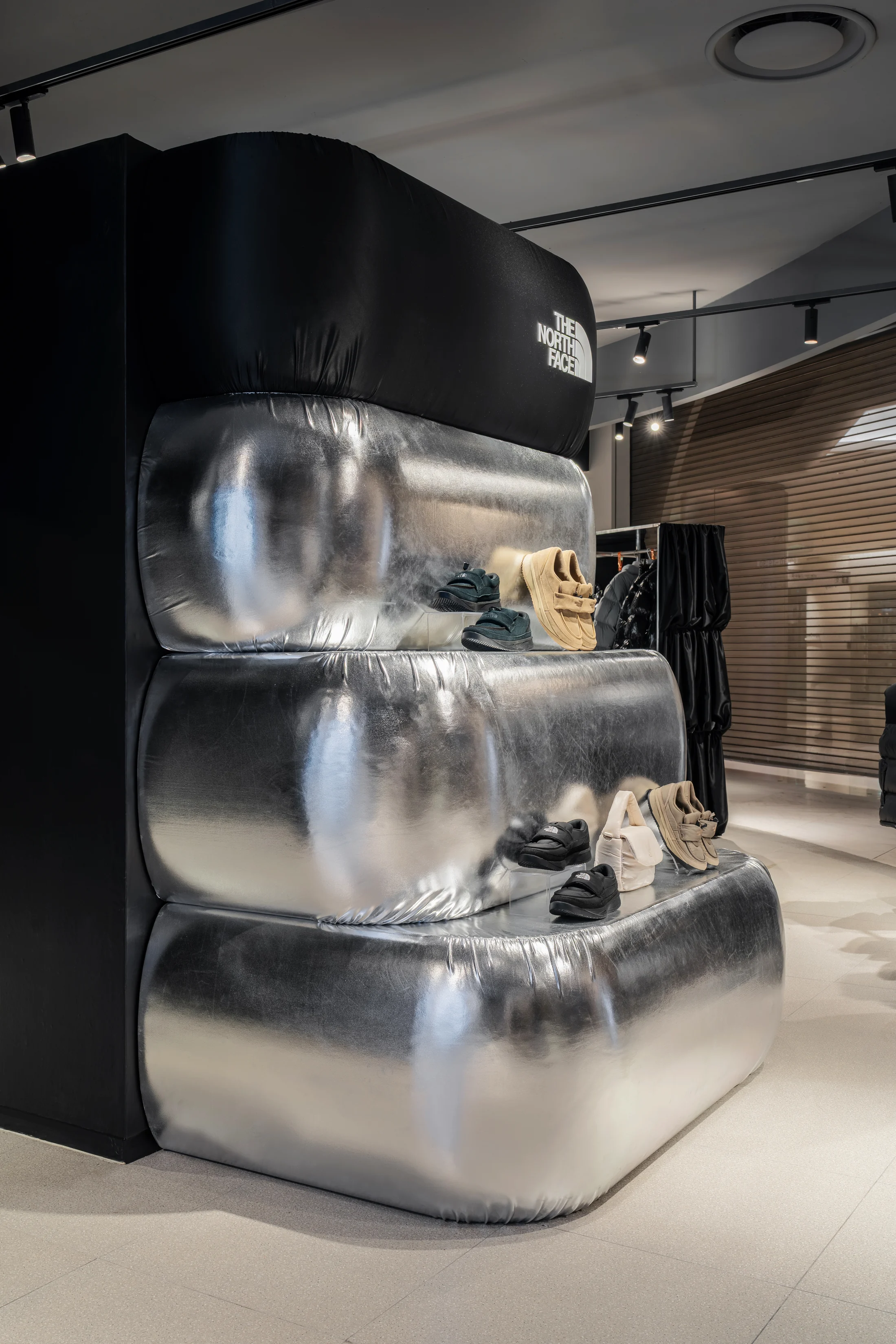
부드럽게 셔링된 블랙 패브릭은 벽과 디스플레이의 표면이 되고, 부풀린 실버 매스는 상품을 놓는 조형적 선반이 됩니다. 얇고 단단한 메탈 프레임은 풍성한 볼륨을 일정한 그리드 안에 정리하며 서로 다른 요소를 하나의 구조로 묶습니다.
Translating not the appearance of the puffer, but the principles that form it, into an architectural scale.
We identified three defining qualities in the Nuptse puffer: air-filled volume, folds shaped by padding and seams, and a sheen that changes with light. These qualities were translated into a spatial grammar of VOLUME, FOLD, and REFLECTION.
Softly gathered black fabric becomes the surface of walls and displays, while inflated silver masses form sculptural shelves for products. Slender, rigid metal frames organise the generous volumes within a clear grid, binding the different elements into one structure.
Space & Experience
제품의 물성이 하나의 장면이 되도록.
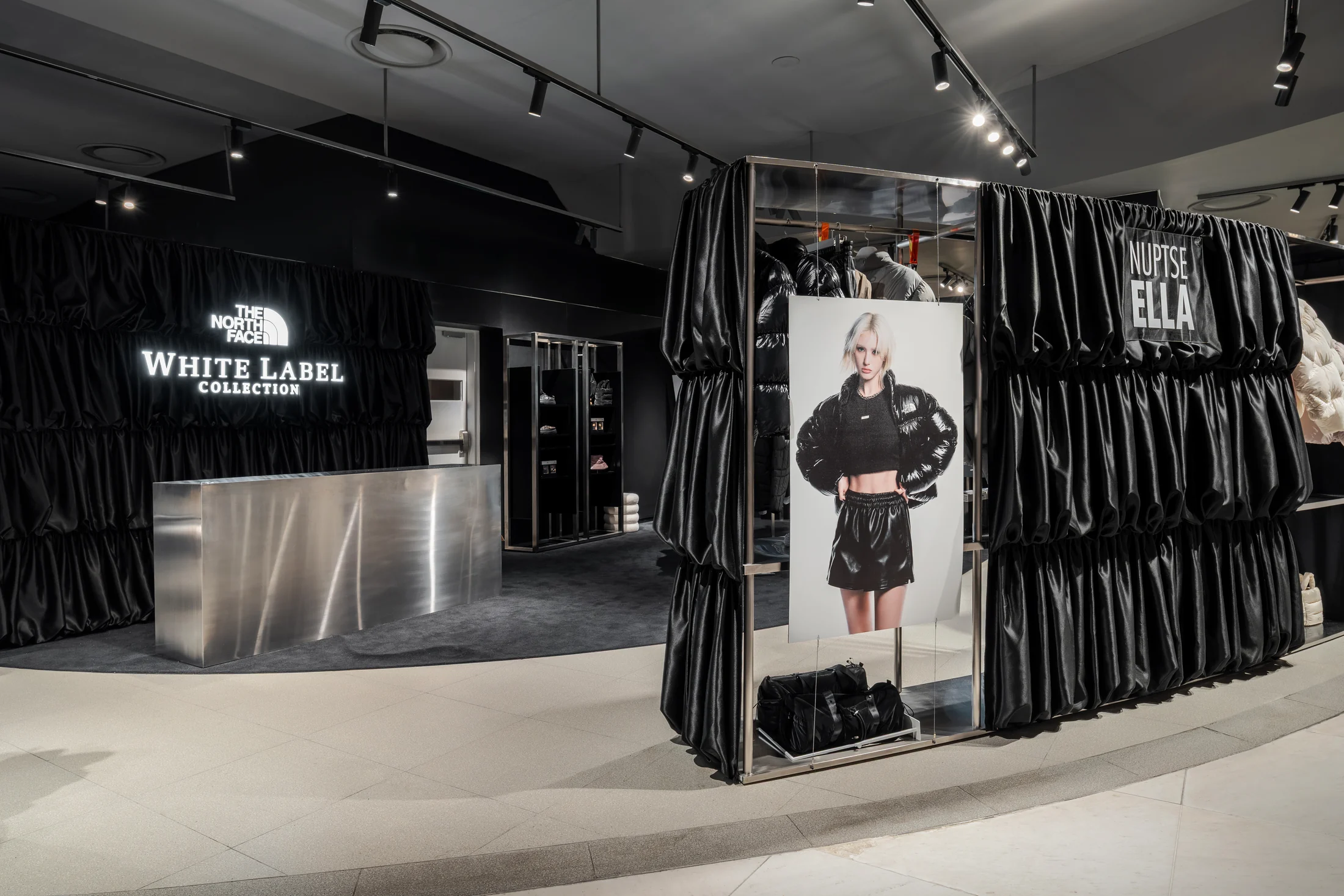
멀리서는 블랙과 실버의 대비가 팝업의 경계를 만들고, 가까이 다가가면 패브릭의 주름과 메탈의 반사, 패딩의 광택이 서로 이어집니다. 중앙과 가장자리의 디스플레이는 시야를 막지 않으면서 방문자의 움직임을 자연스럽게 안쪽으로 이끕니다.
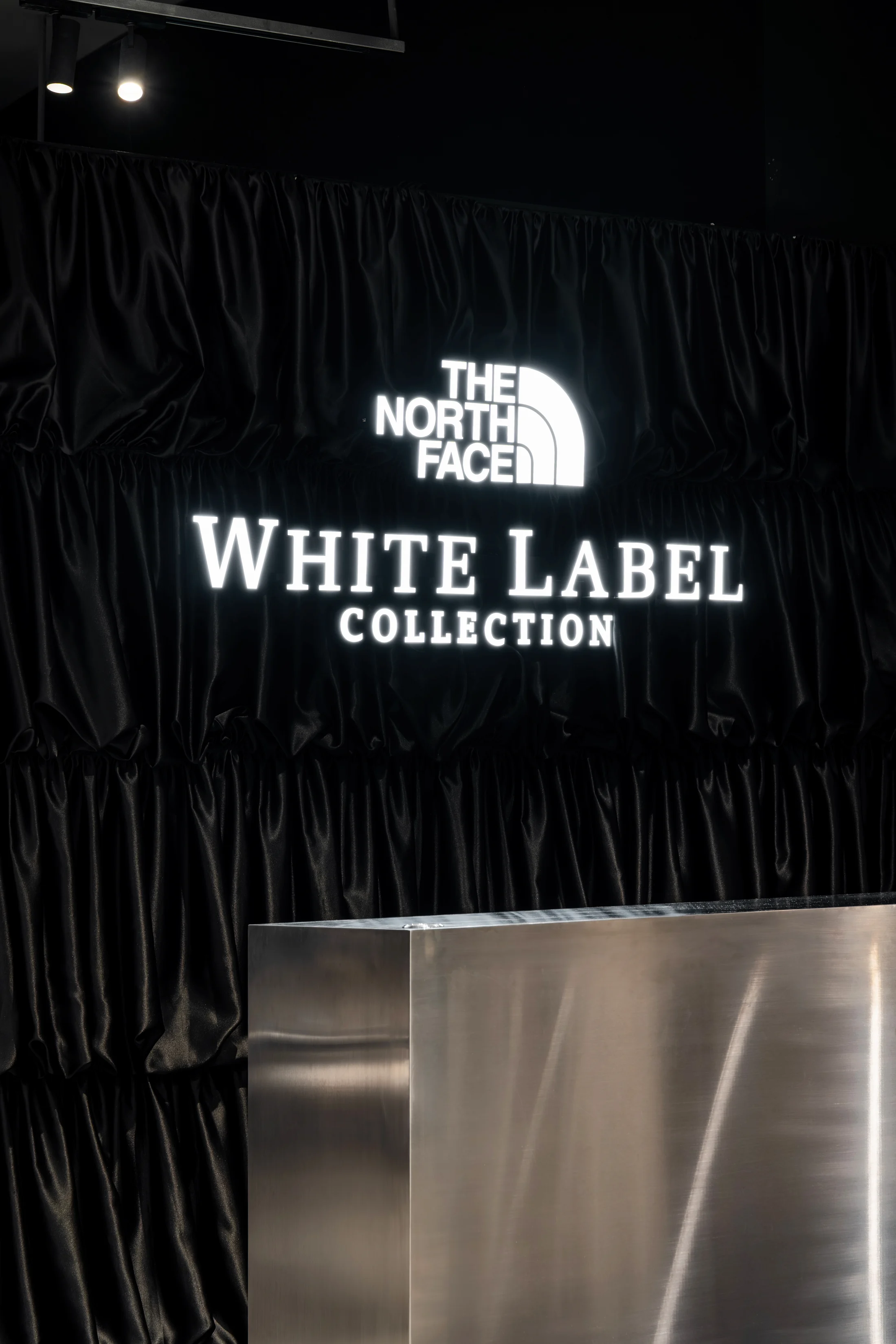
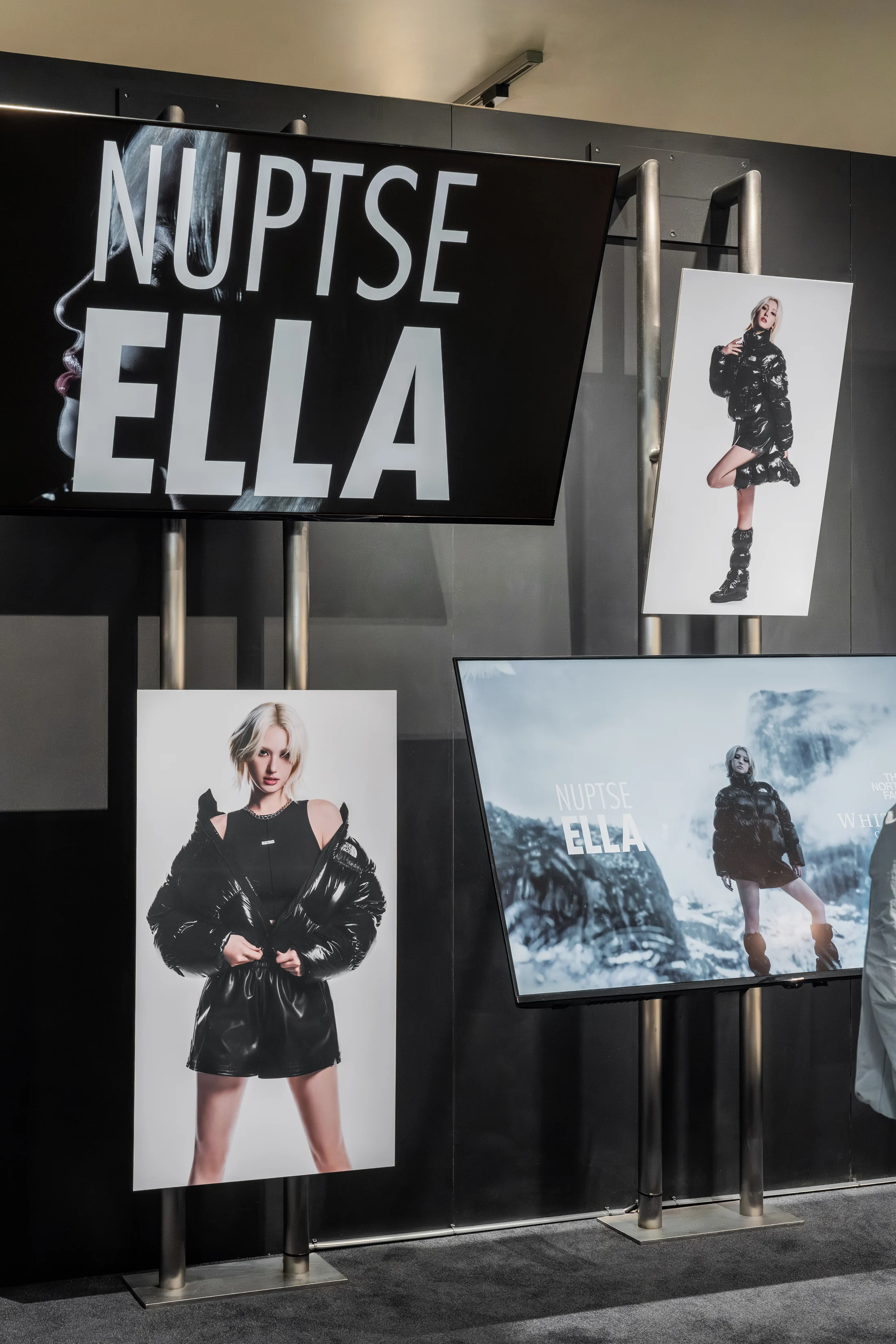
블랙 셔링 월의 발광 사인, 실버 볼륨 디스플레이, 캠페인 이미지와 거울은 각기 다른 장면을 만들지만 같은 물성의 흐름 안에서 연결됩니다. 제품을 보는 경험과 공간을 감각하는 경험이 분리되지 않도록 구성했습니다.
Turning the material presence of the product into one continuous scene.
From a distance, the contrast of black and silver defines the boundary of the pop-up. Up close, folds of fabric, reflections in metal, and the sheen of the puffers connect across the space. Displays at the centre and edges preserve open sightlines while guiding visitors naturally inward.
The illuminated sign on the gathered black wall, the silver volume display, campaign imagery, and mirrors each create a distinct scene, yet remain connected through a shared material language. The experience of viewing the product and sensing the space becomes one continuous encounter.
too cool for school ↗
Choix chou chou ↗
LEONARDI ↗
GOYO WEAR ↗